Preissig Antikva Pro
→ Brochure Design
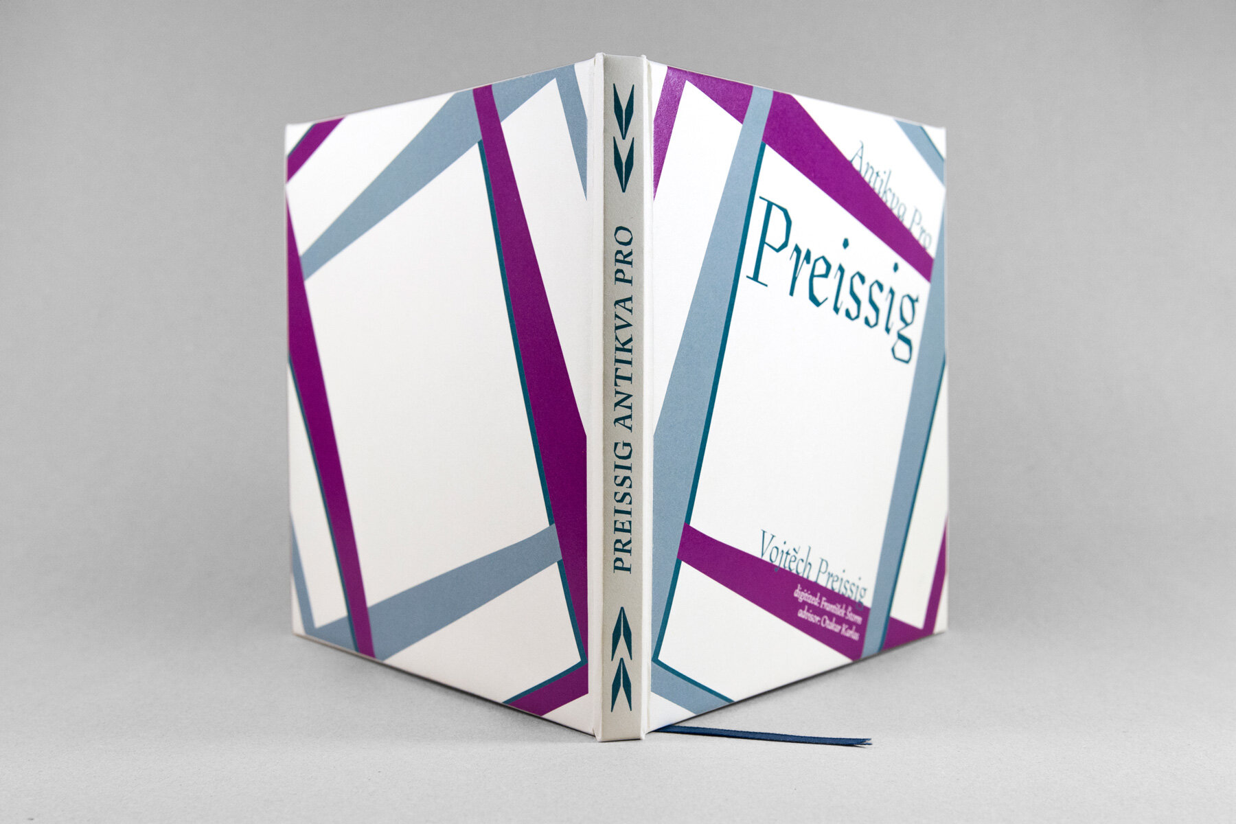
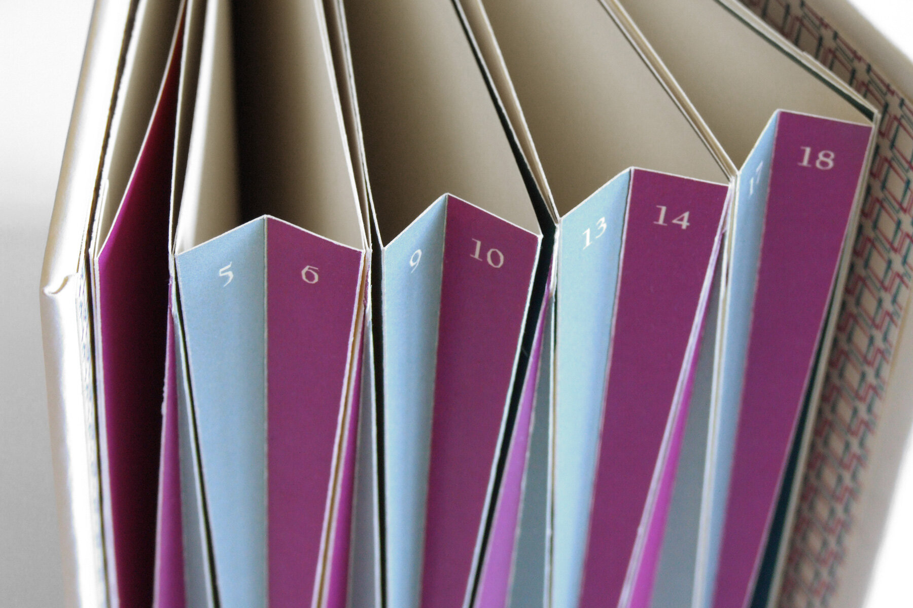
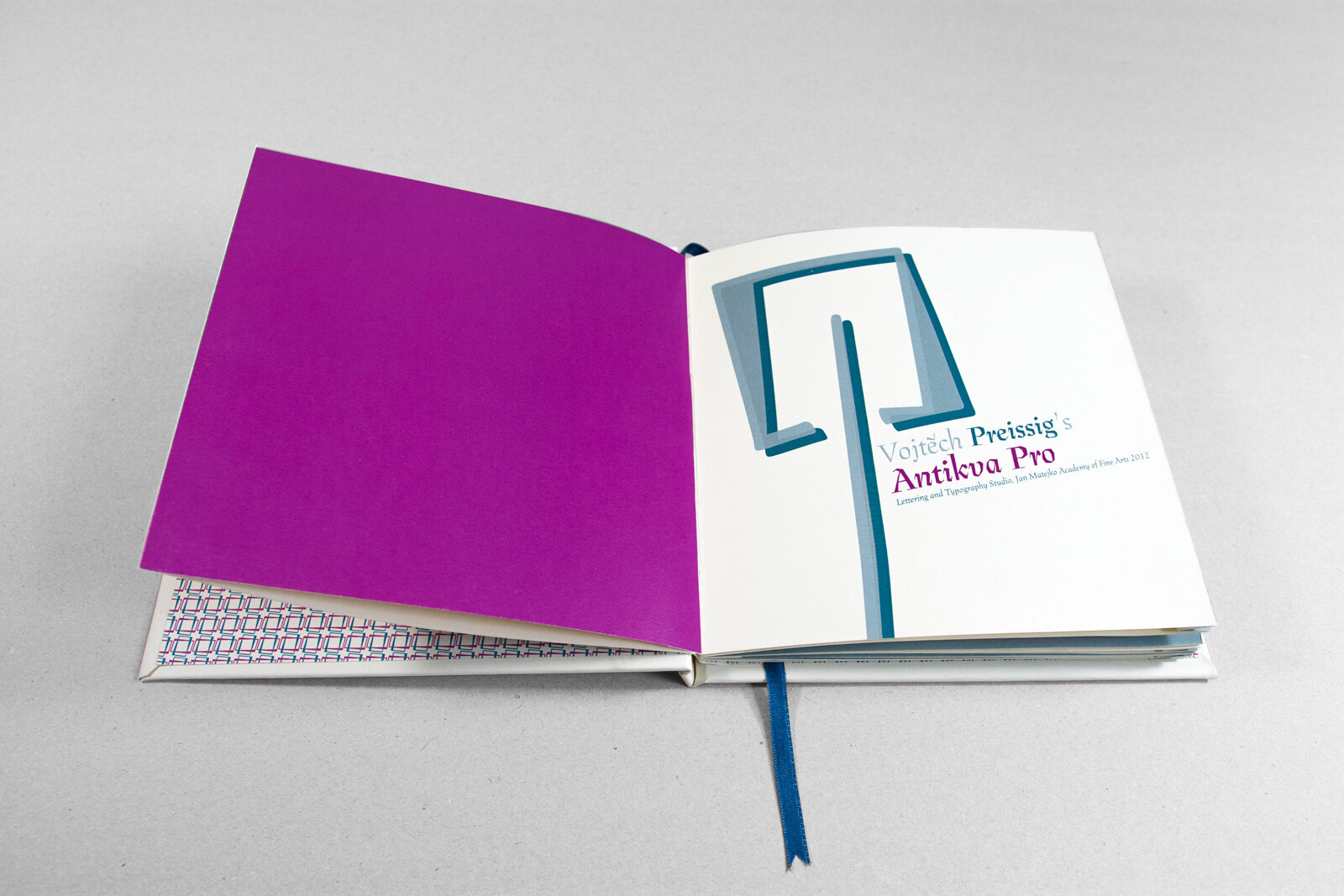
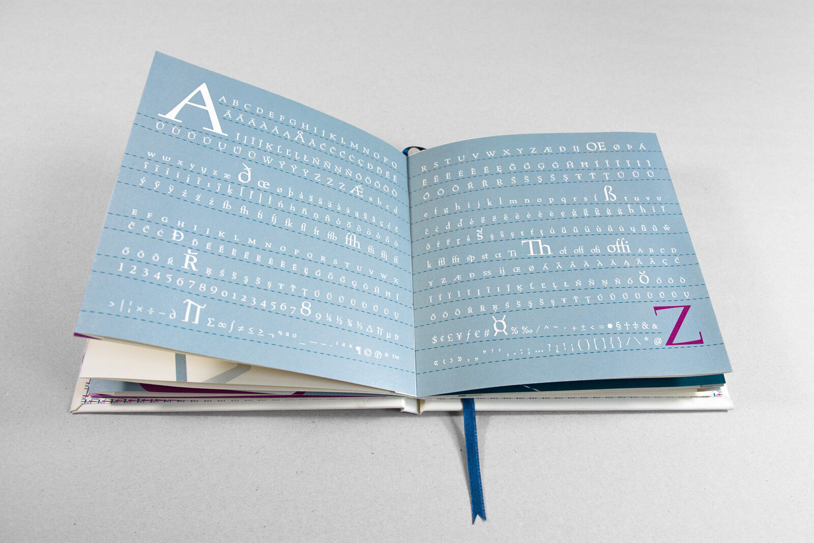
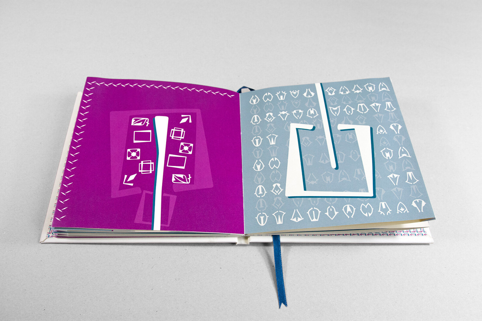
Preissig Antikva Pro is a typeface designed by Vojtech Preissig in the early 20th century. It is based on the traditional graphic techniques of linocut and woodcut. The task was to design catalogue presentation considering the specifics of this typeface. Interesting detail is that the lines of individual characters (letters) are not parallels. I used this fact when creating the catalog, so the individual elements seem to fly on the pages. Catalogue is hardcover with hand-sewn binding. I supplemented it with atypical page numbering in the spaces that creates an accordion impression.
Created at Jan Matejko Academy of Fine Arts in Cracow
Year: 2012